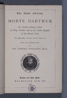
 Morte Darthur
Globe editions were a series of English classics published by Macmillan between 1864 and 1976. The aim of the series was ‘to make it possible for the universal kin of English-speaking men to hold communion with the loftiest “spirits of the mighty dead”’: that is, to produce accurate editions, clearly printed, in a convenient form at a moderate price within the reach of all social classes. A globe impressed on the cover of volumes declared the vision in pictorial form. Students were a specific market, as the books were used as university textbooks. Caxton’s Malory, ‘revised for modern use’, was a staple of the series, printed several times between 1868 and 1941. The edition shown includes an index. It cost 3 shillings and sixpence, and was advertised as ‘beautifully printed on toned paper and bound in cloth’. ‘Beautifully’ is here synonymous with ‘clearly’. The text is small, 1 millimetre in size, there are 53 lines per page, and each page is printed in two columns, a space- and therefore paper-saving and cost-cutting device.
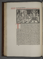 The Noble and Joyous Book Entytled Le Morte Darthur
Inspired by William Morris’s Kelmscott Press, Charles Harold St John Hornby founded the Ashendene Press in 1895 to produce fine books. His edition of Malory is a particular triumph. In a letter to Hornby of 12 October 1913 the manuscript scholar, collector and museum director Sydney Cockerell wrote: “The Morte d’Arthur is a glorious piece of printing and … it is an achievement of which you and all who follow the developments of fine craftsmanship in England may well be proud. … The presswork is miraculous. Black, red & blue are all quite perfect, with never anywhere so much as a hint of spread.” Three days later Emery Walker, founder of the Doves Press, enthused about the Malory: “with the Dante it shows that England is still ahead of the world in fine printing.” Hornby himself described the Malory, which took three years to produce, as one of his best books.
The text follows Robert Southey’s edition of Caxton’s Malory published by Longman in 1817. The appearance of the book recalls incunabula. type is Subiaco, so called because it is based on the type used by Konrad Sweynheym and Arnold Pannartz at Subiaco in 1462 when they carried printing from Germany to Italy. The paper is handmade. The painter and illustrator Charles Gere, who had illustrated some Kelmscott Press books, and his painter sister Margaret designed the 29 woodcuts. The calligrapher Graily Hewitt designed the blue and red initials. The book was a collector’s item. Only 153 copies were printed. The 145 copies printed on paper cost 12 guineas each (over a month’s wages for a skilled tradesman); the eight printed on vellum, a staggering 50 guineas.